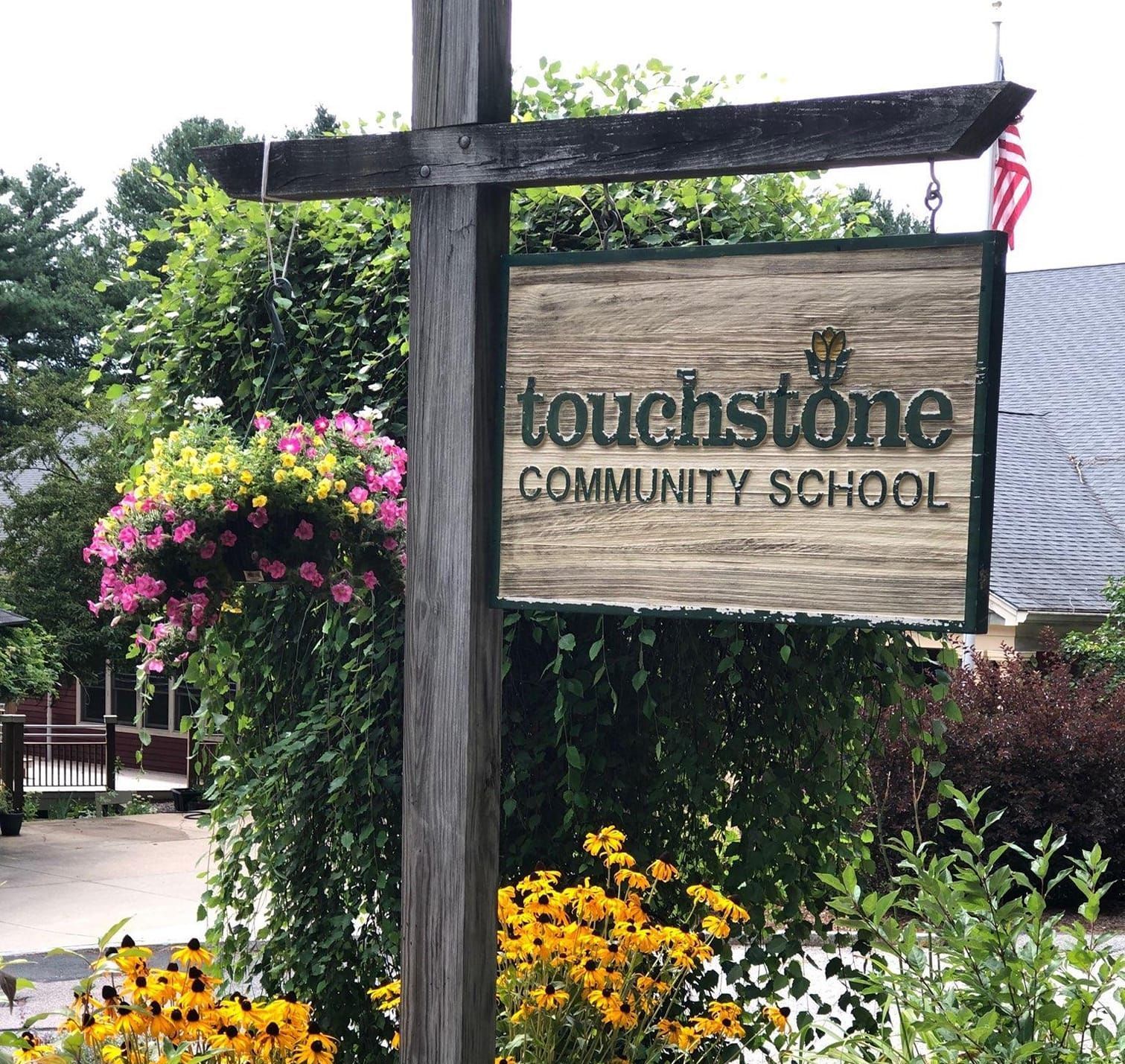
Returning to our roots - a 2024 visual rebrand.
Touchstone's logo has returned to its roots. Our tulip is a unique and timeless design that fits nicely in this current market moment where brands are looking back to the color and bold lines that dominated 1960s-1990s design. The original tulip included versions where peach, watermelon, and lavender were emphasized. In the current iteration, we're embracing bolder earth tones to complement the traditional yellow and green. The design elements that will pair with this logo maintain the retro element of a serif font with clean, modern styling. Polly Brown, founding parent and teacher remembers the original tulip as a symbol of regenerative growth, brightness, and hope for the future, principals that all still very much underlie our collective hopes for Touchstone and, by extension, our children. Returning to the tulip returns us to a striking and unique design element that matches our educational philosophy where we take a grounded (rooted, you might say) approach to Progressive education.


